css3
I have a table whose tds are created dynamically. I know how to get the first and last child but my question is:
Is there a way of getting the second or third child using CSS?
Source: (StackOverflow)
My Question(s)
Are any of these methods preferred by a professional web designer?
Are any of these methods prefereed by a web browser when drawing the website?
Is this all just personal preference?
Are there other techniques I'm missing?
Note: Above questions are in regards to designing a multi-column layout
float:left;
http://jsfiddle.net/CDe6a/
This is the method I always use when creating column layouts, and it seems to work just fine. The parent does collapse on itself though, so you just need to remember to clear:both; afterwards. Another con that I just found was the inability to align text vertically.
display:inline;
This seems to correct the problem of the collapsing parent, but adds whitespace.
http://jsfiddle.net/CDe6a/1/
Removing whitespace from html seems to be the easiest fix this problem, but is not desired if you are really picky about your html.
http://jsfiddle.net/CDe6a/2/
display:inline-block;
Seems to behave exactly like display:inline;.
http://jsfiddle.net/CDe6a/3/
display:table-cell;
http://jsfiddle.net/CDe6a/4/
Works perfect.
My thoughts:
I'm sure I'm missing a ton of stuff, like certain exceptions that will break the layout but, display:table-cell; seems to work the best, and I think I will start replacing float:left; as I always seem to mess up on clear:both;. I've read many articles and blogs about this on the web, but none of them give me a definite answer on what I should use when laying out my website.
Source: (StackOverflow)
ok say the content inside the <body> totals 300px high.
If I set the background of my <body> using -webkit-gradient or -moz-linear-gradient
Then I maximize my window (or just make it taller than 300px) the gradient will be exactly 300px tall (the height of the content) and just repeat to fill the rest of the window.
I am assuming this is not a bug since it is the same in both webkit and gecko.
But is there a way to make the gradient stretch to fill the window instead of repeat?
Source: (StackOverflow)
I want to rotate a single word of text by 90 degrees, with cross-browser (>= IE6, >= Firefox 2, any version of Chrome, Safari, or Opera) support. How can this be done?
Source: (StackOverflow)
Is there a straight forward CSS way to make the border of an element semi-transparent with something like :
border-opacity:0.7;
?
If not, does anyone have an idea how I could do so without using images?
Source: (StackOverflow)
This question already has an answer here:
Is it possible to make a div 50px less than 100% in pure CSS? I want the <div> to be only 50px less than 100%. I don't want any JavaScript.
Source: (StackOverflow)
I want to use CSS3 gradients for my background-color and then apply a background-image to apply some sort of light transparent texture.
Is this possible?
Source: (StackOverflow)
I am designing a new website and I want it to be compatible with as much browsers and browser settings as possible. I am trying to decide what unit of measurement I should use for the sizes of my fonts and elements, but am unable to find a conclusive answer.
My question is: should I use px or rem in my CSS?
- So far I know that using
px isn't compatible with users who adjust their base font size in their browser.
- I've disregarded
ems because they are more of a hassle to maintain, compared to rems, as they cascade.
- Some say that
ems are resolution independent and therefore more desirable. But others say that most modern browsers zoom all elements equally anyway, so using px is not a problem.
I'm asking this because there are a lot of different opinions as to what is the most desirable measure of distance in CSS, and I am not sure which is best.
Source: (StackOverflow)
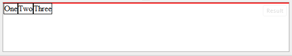
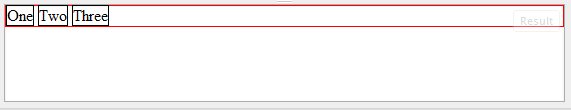
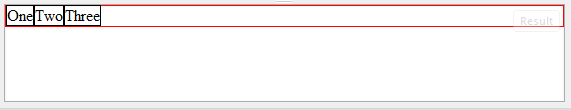
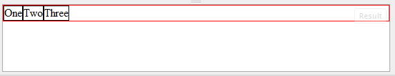
I'm using twitter bootstrap 3, and I have problems when I want to align vertically two div, for example — JSFiddle link:
<!-- Latest compiled and minified CSS -->
<link rel="stylesheet" rel='nofollow' href="https://maxcdn.bootstrapcdn.com/bootstrap/3.3.4/css/bootstrap.min.css">

<!-- Optional theme -->
<link rel="stylesheet" rel='nofollow' href="https://maxcdn.bootstrapcdn.com/bootstrap/3.3.4/css/bootstrap-theme.min.css">

<!-- Latest compiled and minified JavaScript -->
<script src="https://maxcdn.bootstrapcdn.com/bootstrap/3.3.4/js/bootstrap.min.js"></script>
<div class="row">
  <div class="col-xs-5">
    <div style="height:5em;border:1px solid #000">Big</div>
  </div>
  <div class="col-xs-5">
    <div style="height:3em;border:1px solid #F00">Small</div>
  </div>
</div>
Grid System of Bootstrap use float: left , not display:inline-block, so the property vertical-align doesn't work. I tried using margin-top to fix it, but I think this is not a good solution for the responsive design.
Source: (StackOverflow)
IE9 is apparently able to handle rounded corners by using the CSS3 standard definition of border-radius.
What about support for border radius and background gradient? Yes IE9 is to support them both separately, but if you mix the two the gradient bleeds out of the rounded corner.
I am also seeing strangeness with shadows showing as a solid black line under a box with rounded corners.
Here are the images shown in IE9:
How can I work around this problem?
Source: (StackOverflow)
I have just installed IE9 beta and on a specific site I created (HTML5) IE9 jumps to compatibility mode unless I manually tell it not to. I have tried removing several parts of the website but no change. Including removing all CSS includes. On some other website of me it goes just fine.
Also, don't set it manually because then IE9 remembers the user setting and you can't turn it back to automatic (or at least I haven't found how, not even via private browsing and emptying cache)
Anyway. The site where it jumps to compatibility mode: http://alliancesatwar.com/guide/
One where it renders correct: http://geuze.name/basement/ (I can't post more than 1 hyperlink)
Both use the same doctype and all. Those sites have a lot in common(apart from appearance) using the same basic template(encoding, meta tags, doctype and the same javascript)
It would be great if someone has an answer for me! An HTML5 website that renders in IE7-mode is pretty... lame.
Source: (StackOverflow)
How do I create a shape like this to display on a webpage?
I don't want to use images since they would get blurry on scaling
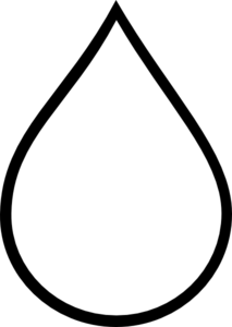
I tried with CSS:
.tear {
  display: inline-block;
  transform: rotate(-30deg);
  border: 5px solid green;
  width: 50px;
  height: 100px;
  border-top-left-radius: 50%;
  border-bottom-left-radius: 50%;
  border-bottom-right-radius: 50%;
}
<div class="tear">
</div>
That turned out really screwed.
And then I tried with SVG:
<svg viewBox="0 100 100">
  <polygon points="50,0 100,70 50,100 0,70"/>
</svg>
It did get the shape, but the bottom part wasn't curved.
Is there a way to create this shape so it can be used in an HTML page?
Source: (StackOverflow)
I'm looking at the MDC page for the @font-face CSS rule, but I don't get one thing. I have separate files for bold, italic and bold + italic. How can I embed all three files in one @font-face rule? For example, if I have:
@font-face {
    font-family: "DejaVu Sans";
    src: url("./fonts/DejaVuSans.ttf") format("ttf");
}
strong {
    font-family: "DejaVu Sans";
    font-weight: bold;
}
The browser will not know what font to use for bold (because that file is DejaVuSansBold.ttf), so it will default to something I probably don't want. How can I tell the browser all the different variants I have for a certain font?
Source: (StackOverflow)
Searching for the ~ one character isn't easy. I was looking over some css and found this
.check:checked ~ .content {
}
What does it mean?
Source: (StackOverflow)
I need to create a box-shadow on some block element, but only (for example) on its right side. The way I do it is to wrap the inner element with box-shadow into an outer one with padding-right and overflow:hidden; so the three other sides of the shadow are not visible.
Is there some better way to achieve this? Like box-shadow-right?
EDIT: My intentions are to create only the vertical part of the shadow. Exactly the same as what repeat-y of the rule background:url(shadow.png) 100% 0% repeat-y would do.
Source: (StackOverflow)